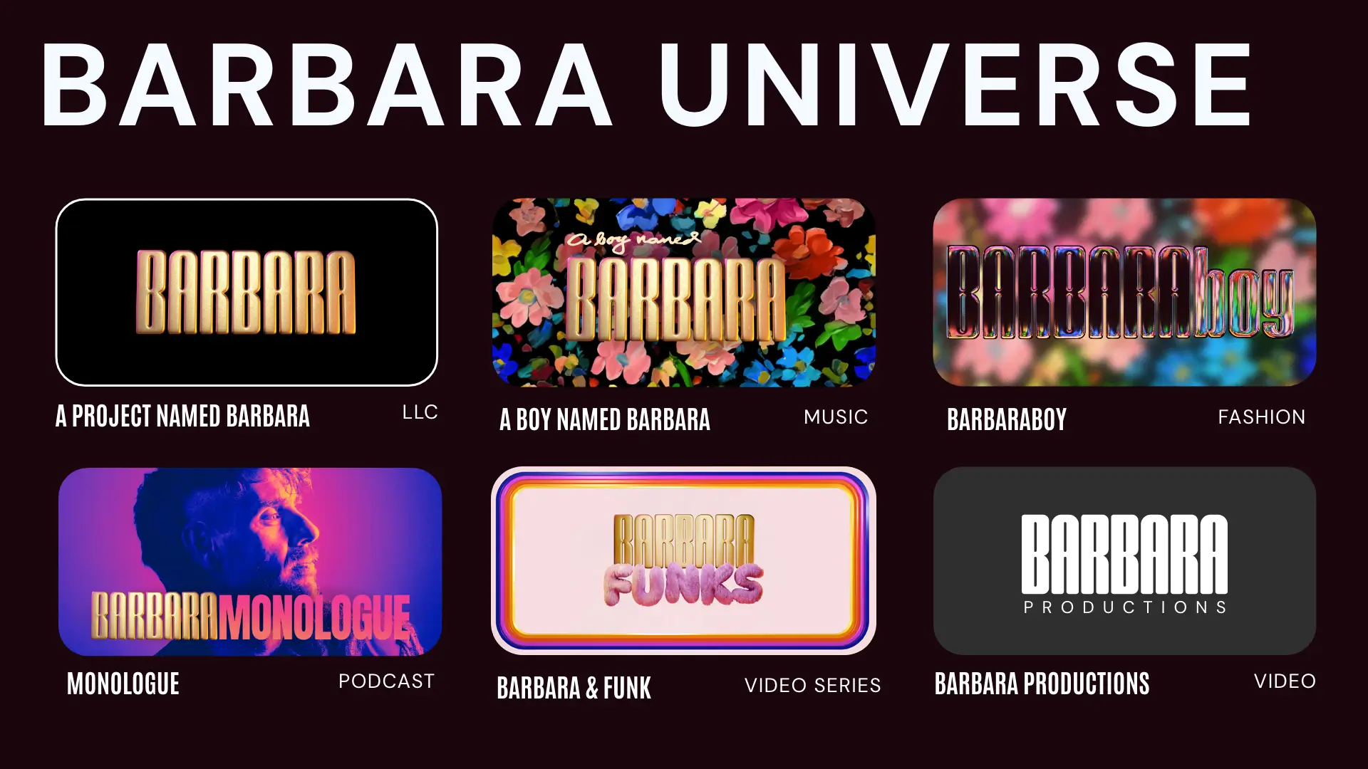
The Barbara Project
A multi-year creative collaboration.
Branding & Web
Branding
Website Development
3D Design/Animation
2025
What began as a single artist brand — A Boy Named Barbara — grew into a multifaceted creative universe.
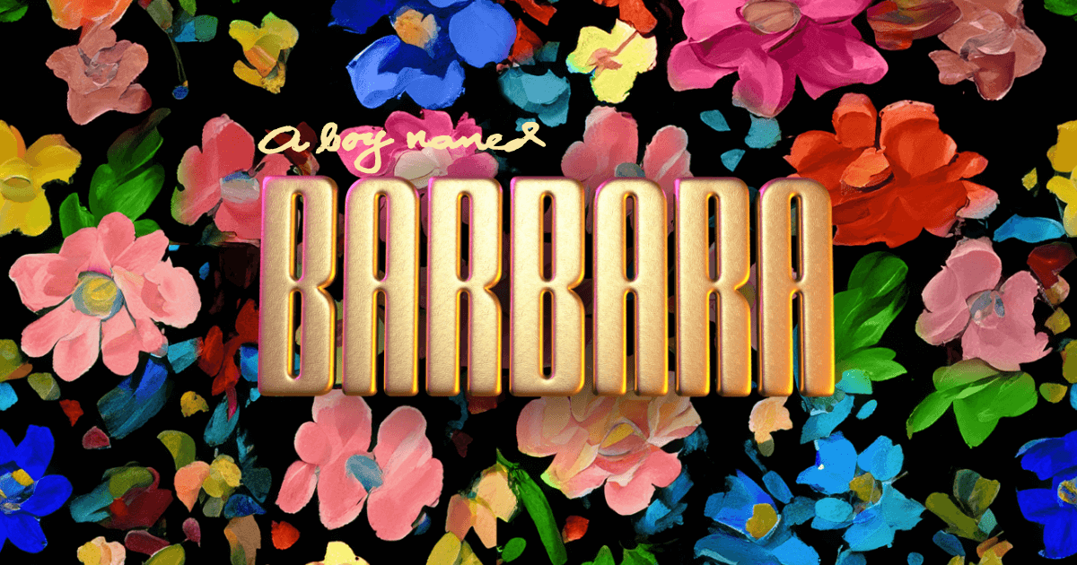
A Boy Named Barbara
Overview
The foundation of the Barbara ecosystem. The goal: create an artist brand that celebrates individuality, collaboration, and disruption through color, texture, and storytelling.
The result is a visual identity that merges the elegance of fine art with the boldness of queer pop culture.
Branding
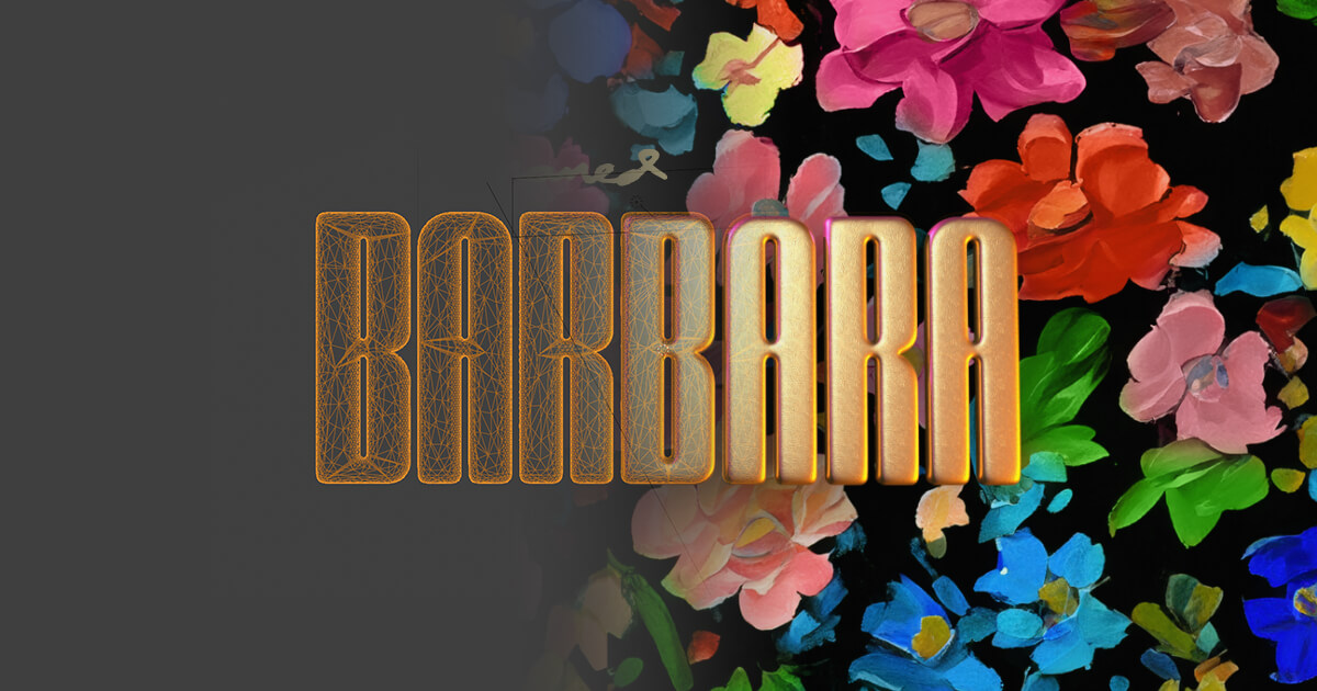
The gold 3D logo is designed to be disruptive—luxurious yet playful. Its polished surface contrasts with a hand-painted floral background, symbolizing the intersection of craft and spectacle. The florals serve as a metaphor for collaboration: a garden of artists creating something beautiful together.
Web Design & DevelopmenT
The custom WordPress site translates Barbara’s world into an immersive online experience. The homepage integrates GSAP animations and dynamic content blocks, celebrating music, fashion, and film in one unified interface. Every element was designed to feel alive—fluid scroll, interactive grids, and cinematic transitions.
Social Media & Campaign Design
Social content extended Barbara’s brand into the real world — connecting performances, collaborations, and culture moments through a consistent visual language. Each post used color, humor, and texture to feel unmistakably “Barbara.”
Design Approach
- Vibrant gradients and halftone treatments to mirror the floral palette
- Use of photography framed in 3D-gilded borders to maintain continuity with the site and logo
- Event and announcement posts designed in bold typographic grids inspired by 1970s record sleeves
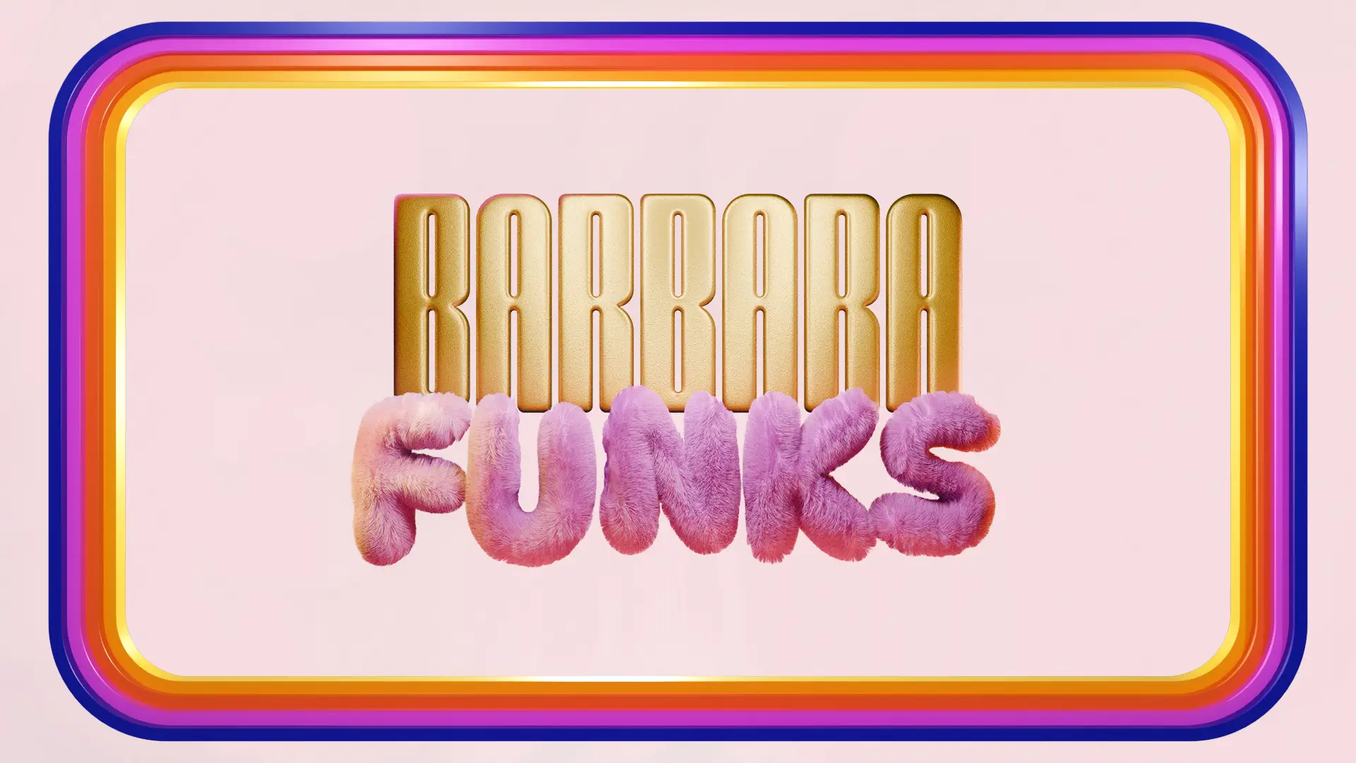
Barbara Funks
Overview
Barbara Funks reimagined Barbara’s identity for the screen.
This 3D-branded talk show blends humor, design, and culture through a playful, retro lens.
Branding & Motion
“FUNKS” was built as a tactile 3D wordmark rendered in plush, fuzzy pink material to contrast the gold Barbara typography. Together they create a dual identity—luxury meets levity. Motion graphics expand this energy through animated intros and looping transitions.”
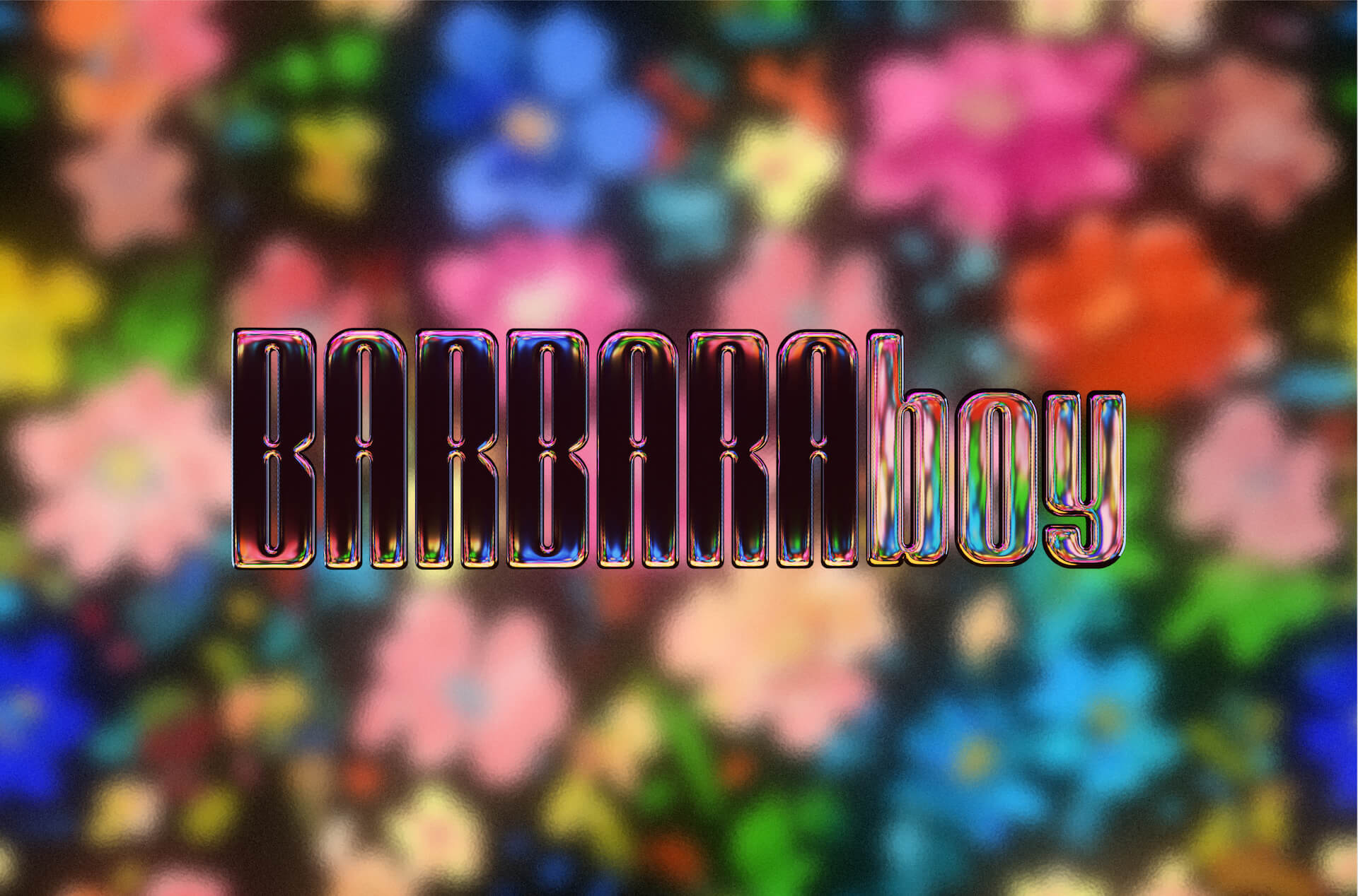
BarbaraBoy
Overview
The next chapter in the Barbara identity—a wearable extension of the brand’s values. BARBARAboy launched as a fashion line and Shopify e-commerce site.
Branding & Web
The BARBARAboy logo reflects the original Barbara florals through refracted color and metallic distortion—a visual metaphor for evolution. The Shopify theme was custom-built to balance minimal typography with expressive photography and product storytelling.
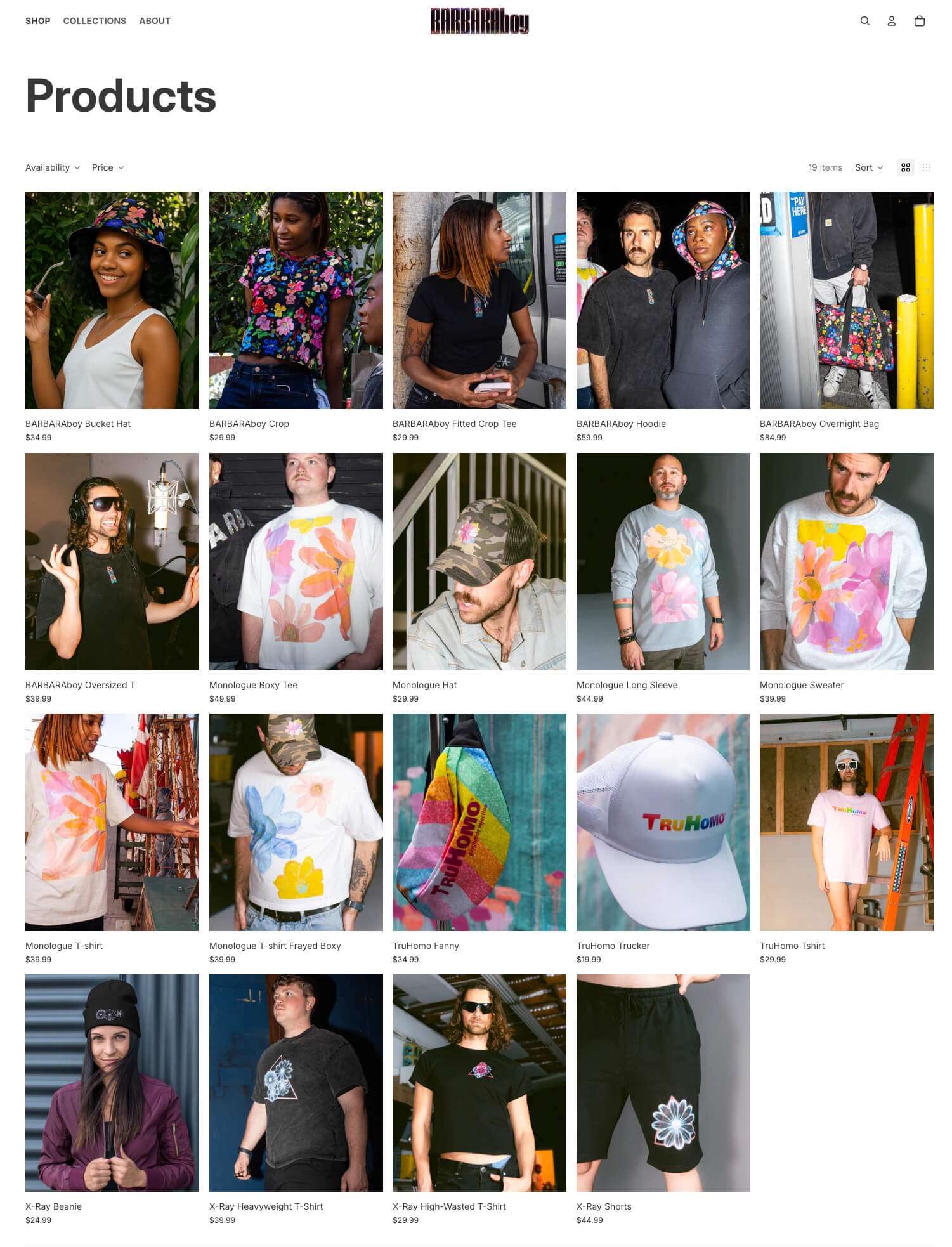
Fashion Design
Over 20 unique apparel and accessory designs were created across multiple collections. Each “fashion line” used core Barbara visual motifs—floral, reflective, chromatic—reinterpreted into fabric prints, embroidery, and silkscreen designs.
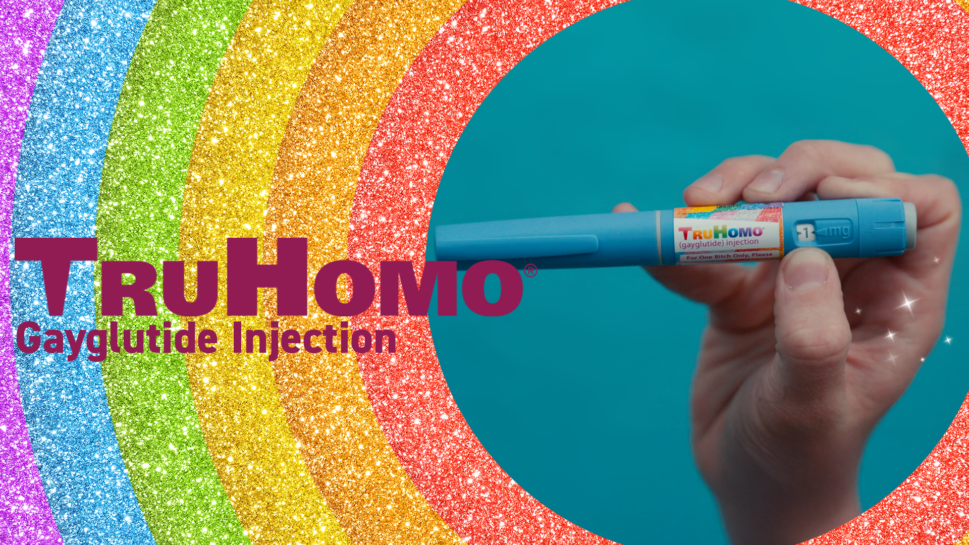
TruHomo
Overview
Originally conceived as a fictional sub-brand for a BarbaraBoy merch line, TruHomo evolved into a standalone concept satirizing consumer culture and queer commodification.
Branding & Tone
Presented as a pharmaceutical parody, the TruHomo logo adopts a friendly corporate aesthetic wrapped in subversive humor. Color, typography, and layout follow clinical design tropes—pink and white minimalism contrasted with rainbow gradients and faux legal disclaimers.
Web & Product Design
A custom WordPress microsite completes the illusion, complete with testimonials, mock prescriptions, and product photography. The satire underscores the absurdity of packaging identity for consumption.
PROJECT SUMMARY
Creative Direction
Evolving from an artist brand to a multi-channel creative ecosystem, The Barbara Project demonstrates the fluid boundaries between art, commerce, and identity.
Scope
Branding · 3D Design · Web Design & Development · Motion Design · E-Commerce · Fashion Design · Photography · Concept Art
Credits
Design, Direction, Development — Josh Hunt / Huntsman Media
Next Project